About Us
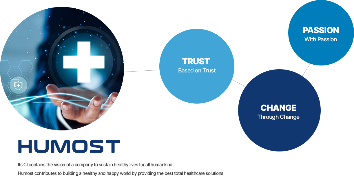
Humost strives to sustain healthy lives for all humankind.
About Corporate Identity (CI)
Background of CI
Humost places the highest priority
on the health of people and humankind.
Humost CI
Mission
‘Humost’ considers ‘human happiness’ through health as its top priority, and its CI contains the vision of a company providing total healthcare solutions.
Meaning
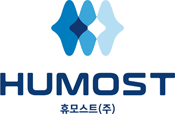
With the image of an electrocardiogram with M and H, the representative initials of Human and Most, as motifs, the symbol is expressed as a combination of three round rhombus shapes, thereby symbolizing the Company’s core values: trust, passion and change. The overall shape of the symbol suggests the health of humankind that continues like an unstoppable heartbeat, based on the Company’s three core values, and at the same time represents the image of a company that is always changing rather than staying in one place. The blue color in Humost’s CI emphasizes its business as a medical company. The light blue expresses flexibility. The blue color expresses smartness. The dark blue color expresses trust. Their overall harmony expresses itself in the form of a future-oriented visual. The bold font expresses the safety and sturdiness of products/technologies and the appearance of an unwavering, strong company.
Symbol Mark

Grid System

Signature/Horizontality

Signature/Verticality

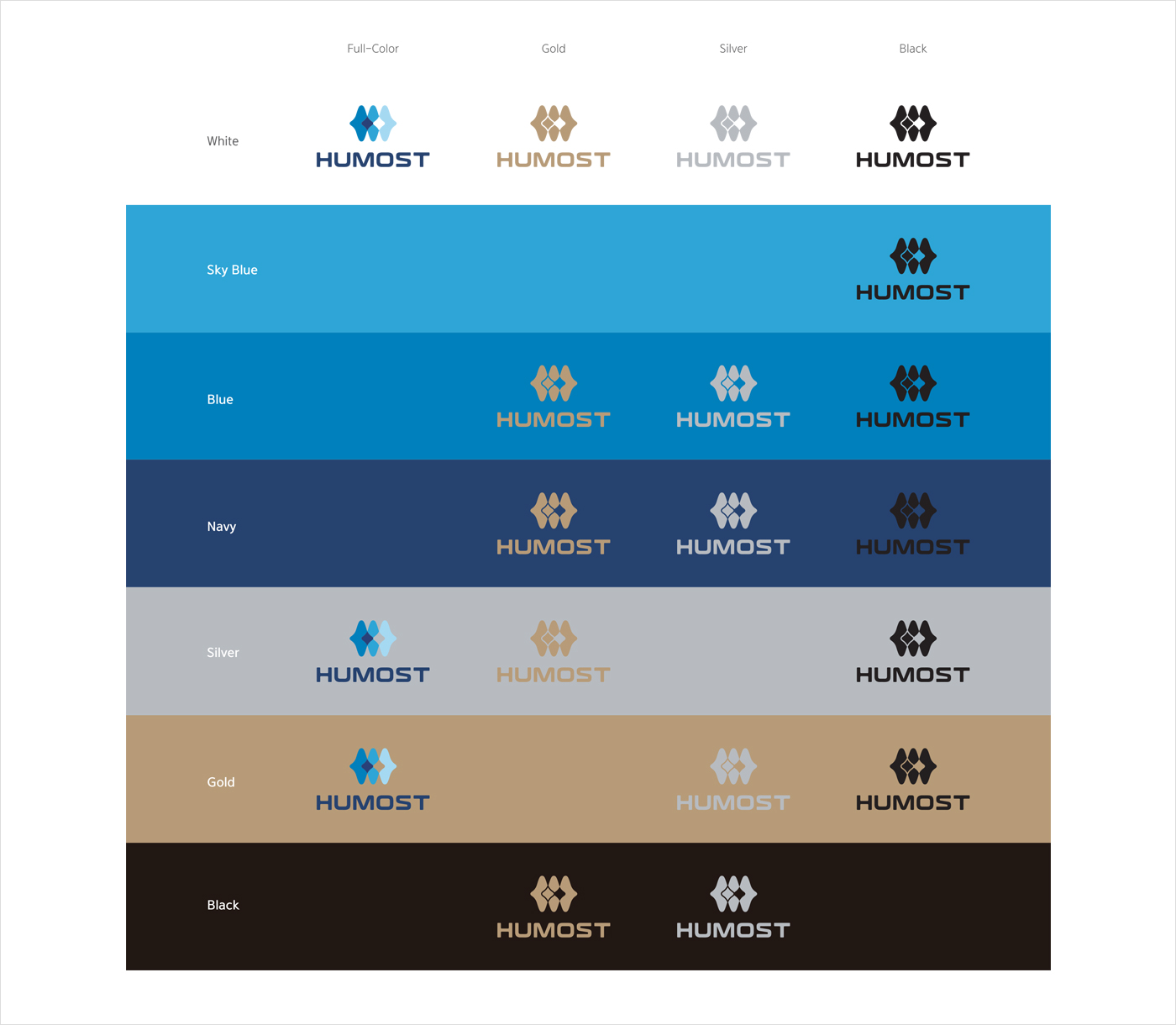
Color Version Per Background Color
Color Version Per Background Color


